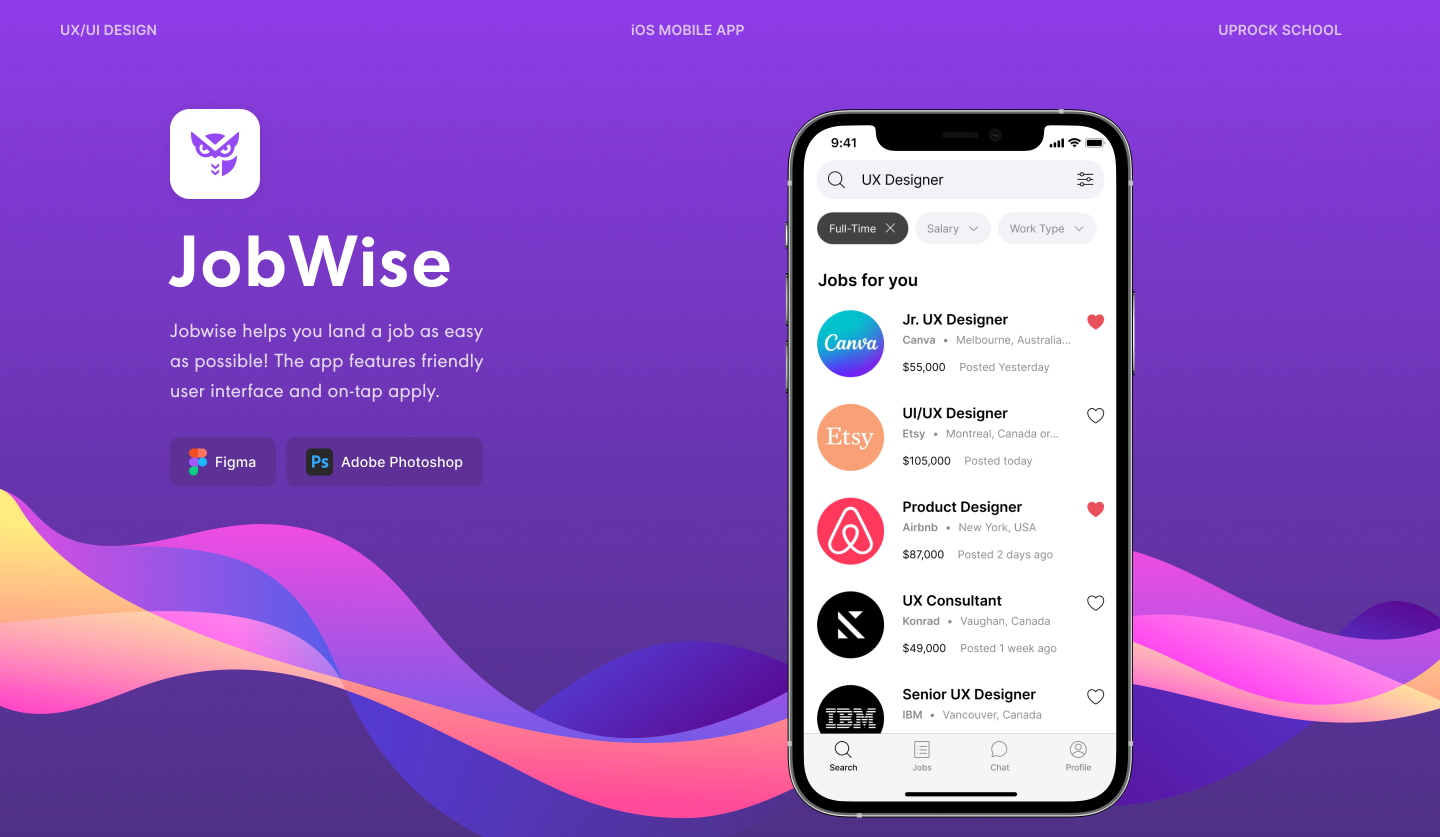
Jobwise
PROJECT OVERVIEW
Jobwise is an iOS job application platform for savvy professionals. The design concept stems from the mission of the company: to help job seekers meet their match.
Duration: 4 months
My Role: UX/UI Designer
MY CONTRIBUTIONS
I designed UX and UI from conception to a visual interactive prototype for Uprock. I gathered requirements and performed Problem Definition, User Research and Testing. Designed a hi-fi prototype in Figma, design system and dark theme with over 70 screens.
Problem Statement
User needs a fast and easy way to to view and apply for jobs because user wants to find their dream job. We will know this to be true when we see that user can apply for a job and get an offer.

User Research and Competitive Analysis
I conducted user research through three methods.
Online Survey:
Surveyed 27 participants about platforms they use and their job application experience.
Interview:
I conducted semi-structured interviews with 3 participants who were looking for a new job.
Competitive Analysis:
Analyzed 3 major & mobile job search platforms: LinkedIn, HeadHunter and Indeed.
Key Findings
- 85% used LinkedIn to apply for jobs
- 64% found jobs through referrals and recruiters
- Only 32% applied on corporate websites
- Over 80% of candidates use smartphones to begin job search process
Pain Points
Long application
Over 81% find that there are too many steps in application process which causes anxiety and abandon the process.
Resume management
Creating new resume for each job, uploading and managing versions is very exhausting for users.
Lack of transparency
Lack of salary information was a major discomfort for 89% of surveyed users.
Mobile App
Poorly adapted mobile versions are a huge problem for jobseekers
User Personas
Based on user research, I crafted 2 user personas: Renata and Rafael to reflect young and savvy job seeker - target users. I discovered that younger people are 5 times more likely to look for a job via smartphone and they wanted a more gamified experience

Problem Definition and Ideation
Based on user research and competitive analysis, I identified that main problem was lack of empathy for job applicants. Recruitment process and job portals focus on the client-side, which causes high application abandonment rates and offer rejections. To attract and retain top talent, companies and job platforms need to simplify application process.
I came up with several solutions to solve the problem that focus on the user-side. To select key functions for MVP, I voted on them based on their feasibility and impact and made a prioritization grid.
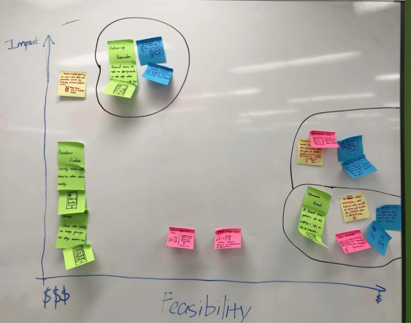
Voting Result
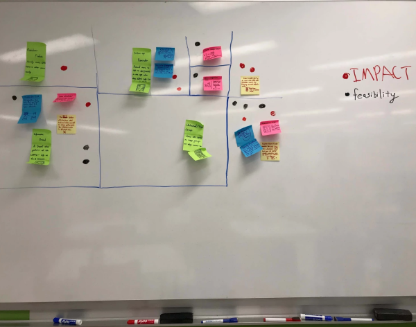
Prioritization Grid
According to the result of the prioritization grid, I identified four key features for the product:
1-tap application
User can apply for a job within one step: answer questions, upload resume and tap Submit.
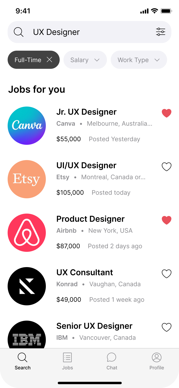
Matching score
User can view if they match the position requirements by viewing a score on the job description
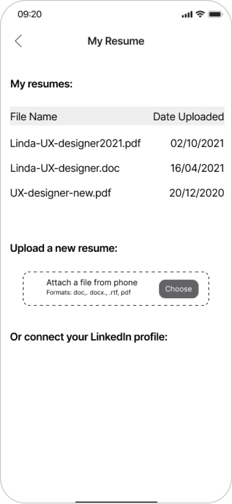
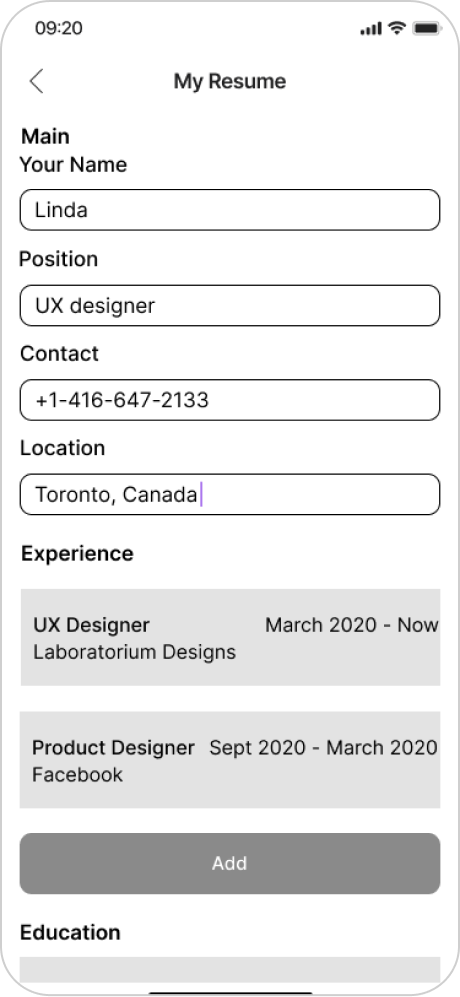
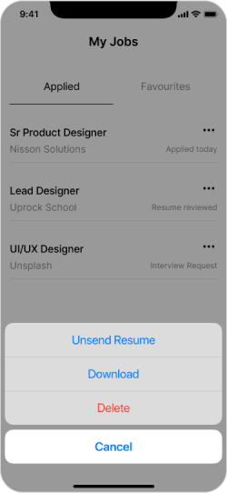
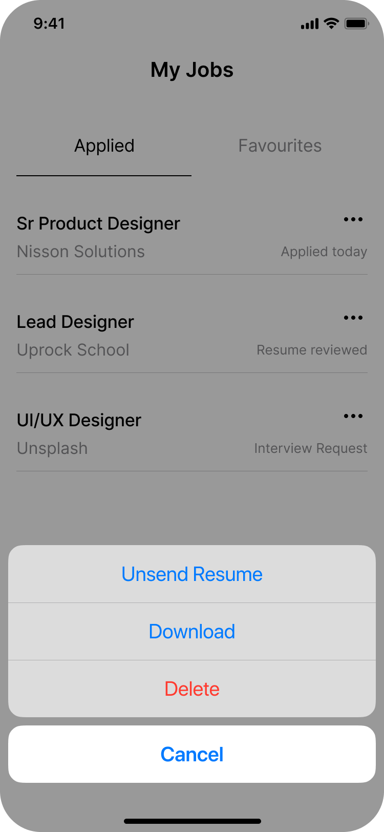
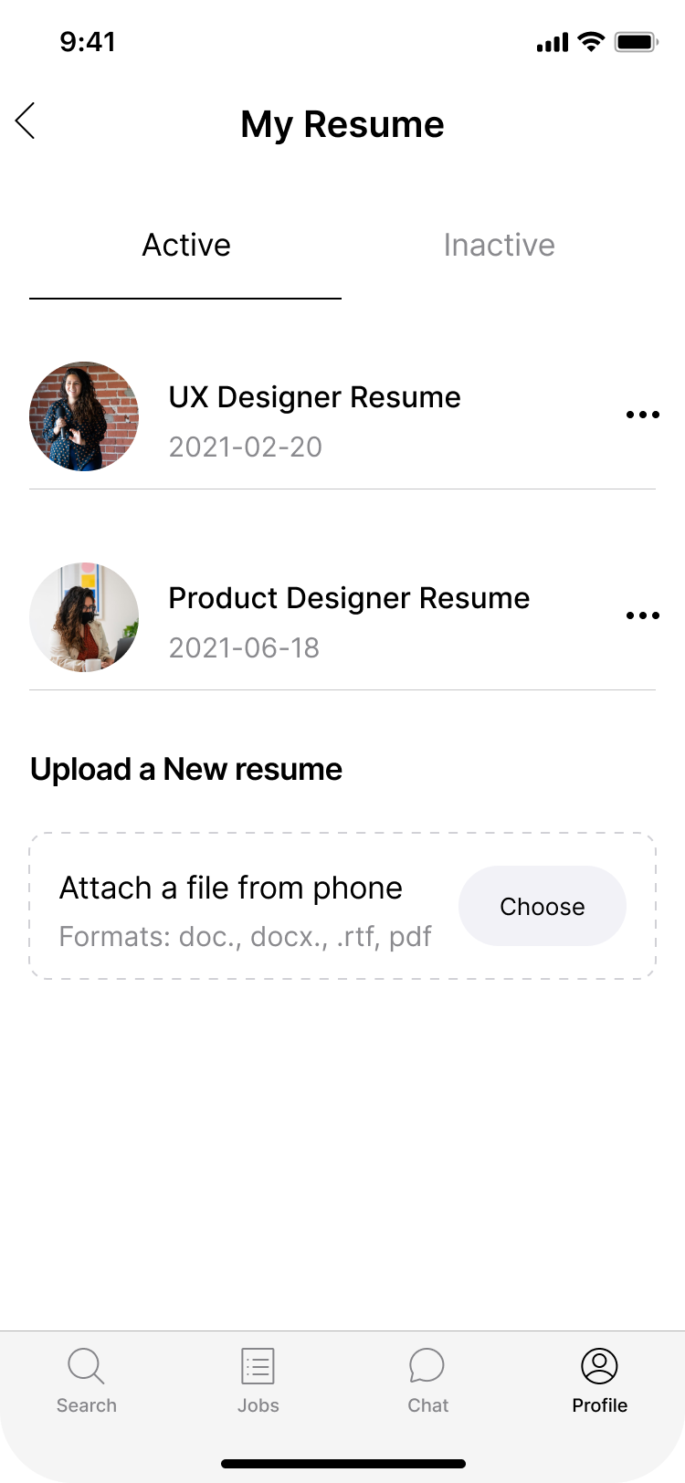
Resume Manager
User can upload resumes when applying or manage versions and edit va Resume manager
Chatbot/concierge
User can get technical support from the chatbot and also receive matching jobs. Also, user can message the job poster.
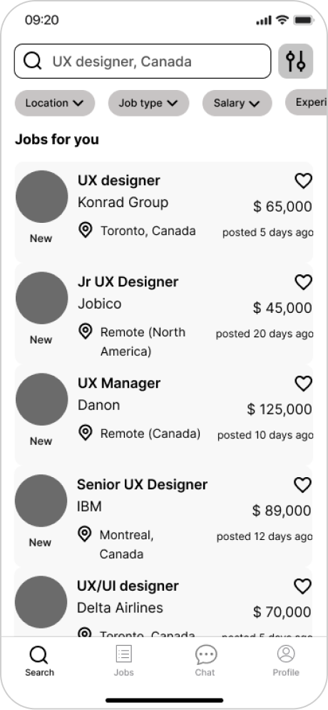
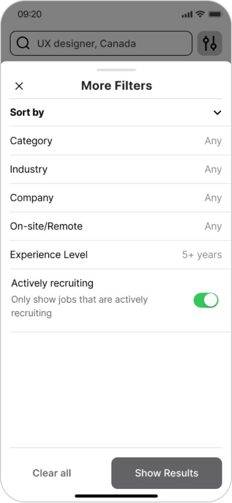
User Flow and Wireframing
Based on four key features, I sketched out key wireframes and the applicant’s user flow and tested them on 3 users.

User Testing
Main user feeback:
- Sign-Up and Onboarding flow for new users was unclear - they didn't know if they should open their email and login from there, and if they can skip Onboarding.
- Inability to change location. This was a big usability problem. User had to choose location during Onboarding, so if they skipped it, how can they select and change location?
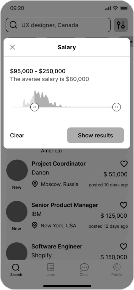
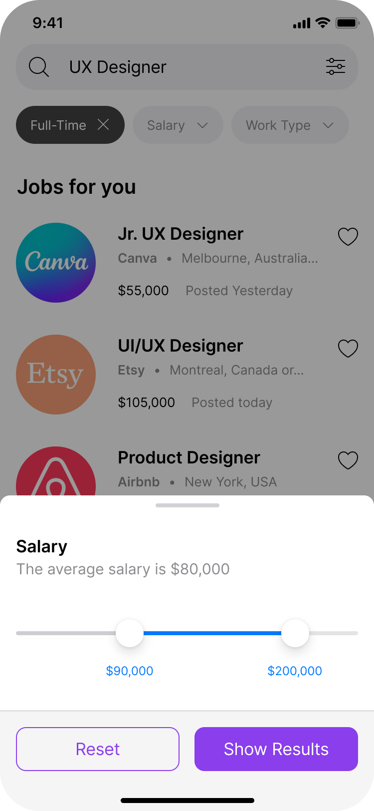
- Confusing slider for salary in Filters. How can user control the range?
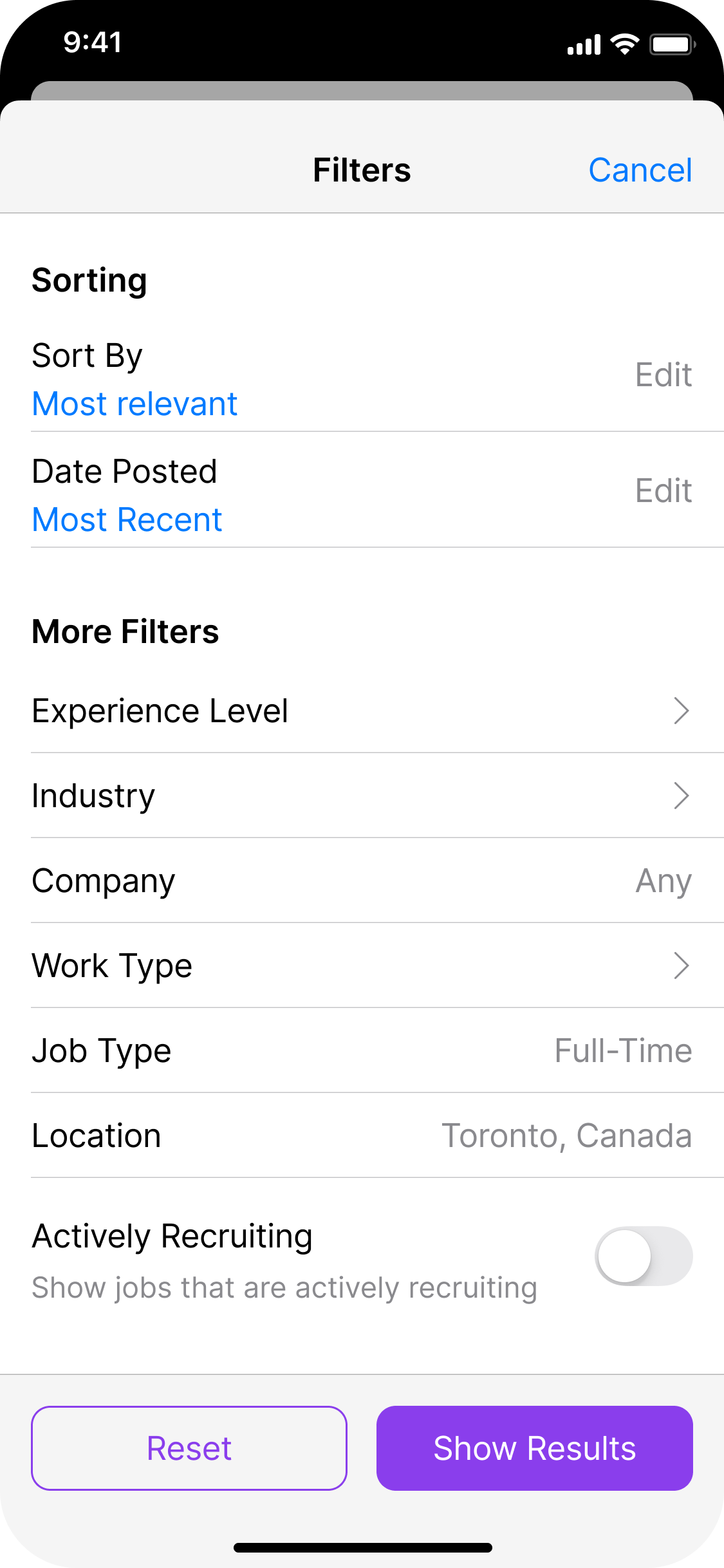
- Other minor usability issues such as modals and pop-ups were fixed after learning more about Human Interface Guidelines.
Prototyping
I fixed lots of usability issues that users faced and improve visual design, user flow for sign-in/sign-up and onboarding, and after testing Job description and Apply pages, a hi-fi prototype was created.
Design System and Branding
After visual design was approved by Senior Designer, I created design system with over 70 components and over 80 screens for Light and Dark theme. I also created logo and app icon for Jobwise. Purple color and owl both symbolize creativity and wisdom, which is why I named the app Jobwise.
Result
Jobwise received positive feedback from Senior Designers and Art Director at Uproch School. Final prototype passed the usability testing of 5 users with over 85% task completion rate and was welcomed by the jobseekers.
